For this assignment I went to Downtown Fredericksburg since it is diverse even if it is a small area. I have been there plenty of times and there are always visual elements that tend to catch my eye. I don’t use any fancy cameras as I believe my phone is capable of taking good pictures. While walking around I didn’t have specific building names, signs or ads in mind. I referred back to the list of concepts that can be found in designs. That is how I chose what to take pictures of and made my photographs more intentional.
1. Metaphor & Symbols
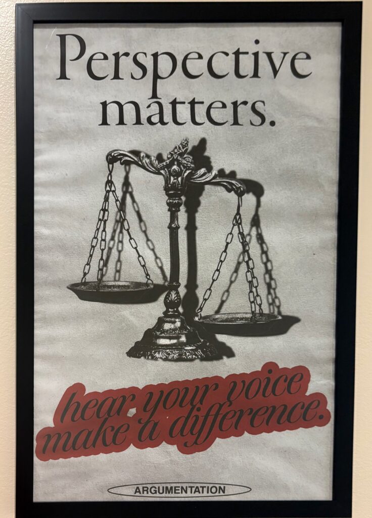
I saw this poster in one of the University of Mary Washington’s academic buildings. I immediately thought of the metaphor and symbol concept when I came across it. The symbol in the middle is the scale of justice, which is often referred to when hearing from both sides of a party and weighing what it implicates. For me, it also ties into the text at the top saying ‘Perspective matters.’ because depending on what side you are, you may be the ‘heavier’ or the ‘lighter’ side. Using metaphors and/or symbols can help give the viewer something to familiarize themselves with when looking at your design.
2. Dominance
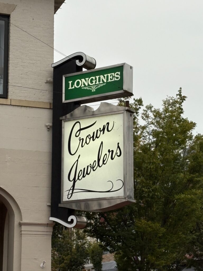
This business sign screamed dominance to me as the big white box drew my eye instead of the green sign above. Depending on what you are looking at you may observe it from top to bottom or left to right. However, as I was walking along Downtown Fredericksburg, my eye was glued to the Crown Jewelers sign. The size and visually interesting font of the sign grabbed my attention before I even noticed the Longines sign. Dominance is an important part to think about when creating designs as it could have an impact on whether or not the viewer is able to comprehend what the focal point of your design is.
3. Minimalism
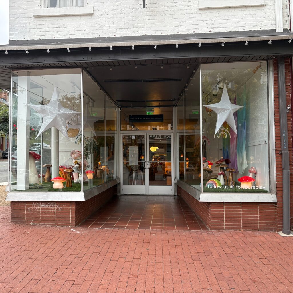
This storefront to me is minimalist compared to all the other storefronts I saw during my exploration of Downtown FXBG. There isn’t a whole lot going on in the entire case. You have hanging stars that take up a section of the upper half of the showcase. Then you have different kinds of mushrooms on the bottom with a fake grass like carpet. Minimalism is an important feature in many designs as it can help the viewer to not feel so overwhelmed with what is in front of them. Minimalist designs are easy on the eye and more digestible to take in. Negative space also allows for the emphasis of what is being showcased.
4. Typography
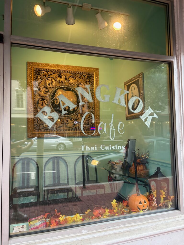
I really enjoyed viewing the typography on this window. To me it was easy on the eyes and it doesn’t have too much going on. I especially like how each word section is in a different font. Yet somehow they all work well with each other (in my opinion). The ‘Bangkok’ text is curved which also adds to the design. I find ‘Cafe’ and ‘Thai Cuisine’ falling under the curve to be visually pleasing. The kerning isn’t too wide yet there is a clear distinction between each letter. Typography plays an important part in how well a design comes together.
5. Proportion
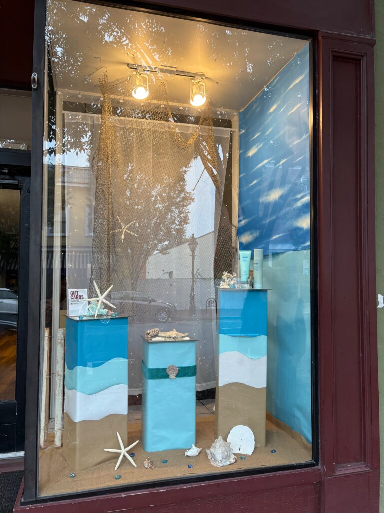
Lastly, I chose this storefront because of the visual hierarchy that is being displayed through proportion. Each of the stands are different sizes which draws viewers to look at the different items placed on the stands. Even though the heights of the stands are not equal there is still some sense of balance going on in the showcase. Proportion is important to include in designs as it can help lead the viewers to a focal point of their sign, artwork, logo etc.
Conclusion
Taking part in this activity was extremely fundamental as someone who doesn’t pay attention to design concepts. Thinking about color, proportion, unity, minimalism etc all play a huge part in how your design will come out. The stores along Downtown FXBG all had their own unique way of showing what they sell, offer and what you may expect when entering the stores. Completing this assignment and taking pictures of certain stores helped me to better understand the different components of design.
Here is my Flickr where I uploaded all the pictures I took.